
We are going to create a custom radar chart using CLI tool and Chart.js library.
First of all, make sure that you have user credentials to a running Zoomdata instance.
For the purpose of this demo, we have created a Flat File source based on the CSV from Data USA.
We start by installing zoomdata-chart-cli tool:
$ npm install zoomdata-chart-cli -gThe CLI tool allows you to configure the default environment (Zoomdata’s server URL and user credentials) once so you never have to enter the information again. You can configure your environment by running the following command:
$ zd-chart configZoomdata comes with a predefined set of JS libraries for custom charts but it doesn’t include the Chart.js (or another JS example chart). You need to add it manually before continuing:
- Download the bundle.
- Run
zd-chart addcommand, providing path to that file:
$ zd-chart add -t library chart.js <path>Now we are ready to create a custom chart:
$ zd-chart createYou are prompted to input a name of the chart, its type, and a source to connect to. Then, name your chart, select the Blank chart type, and then Flat File source from earlier.
When asked if you’d like to continue editing the chart, select yes.
Now, we can link the previously uploaded Chart.js library to our chart. When
prompted, select Libraries > Include/Exclude libraries in the chart:. Pick
chart.js by moving to it with arrows and pressing Space bar.

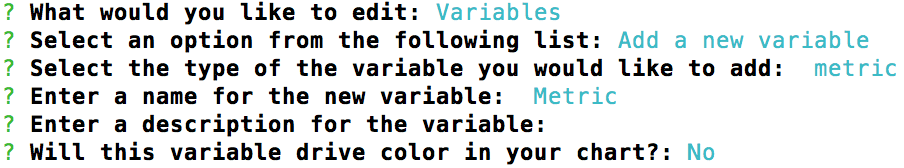
Next, we need to add a Metric variable. Continue editing the chart and choose
Variables > Add a new variable. Pick metric type and call it Metric.
Skip description and answer no when the tool asks whether this variable should
drive color in the chart.
Finally, we want to configure the sorting when working with the chart so we need
to add that control. Select the Controls menu and then select Sort & Limit.

You may need to configure visibility as well. Please check that your chart is
visible by running zd-chart edit for your chart and picking Visibility
when asked.
Time to dive into some code!
Use the following command to download the custom chart on to your machine:
$ zd-chart pullAfter this, you should be able to find a directory named the same as your custom chart. It contains several files and sub-directories.
Find and open the components/Visualization.js file. Replace the contents of
the file with the following code:
/* global controller, Chart */

const canvas = document.createElement('canvas');

controller.element.appendChild(canvas);

const chart = new Chart(canvas, {
  type: 'radar',
  data: getChartData([]),
  options: {
    layout: {
      padding: {
        bottom: 30,
      },
    },
  },
});

controller.createAxisLabel({
  picks: 'Group By',
  orientation: 'horizontal',
  position: 'bottom',
  popoverTitle: 'Group',
});

controller.createAxisLabel({
  picks: 'Metric',
  orientation: 'horizontal',
  position: 'bottom',
});

controller.update = function(data, progress) {
  chart.data = getChartData(data);
  chart.update();
};

function getChartData(data) {
  const groupAccessor = controller.dataAccessors['Group By'];
  const metricAccessor = controller.dataAccessors['Metric'];

  return {
    labels: data.map(item => groupAccessor.raw(item)),
    datasets: [
      {
        data: data.map(item => metricAccessor.raw(item)),
        label: groupAccessor.getLabel(),
        backgroundColor: 'rgba(110, 174, 79, 0.7)',
        borderColor: 'rgb(110, 174, 79)',
      },
    ],
  };
}
We won’t go through the whole file, but you can see that we use Chart from
Chart.js library, passing the necessary options to build the radar
visualization. Documentation about global controller object is available on
Zoomdata knowledge
base.
After you’ve updated the Visualization.js component, make sure that you’re in
the custom chart directory (where a visualization.json file is located) and
push the changes to Zoomdata server:
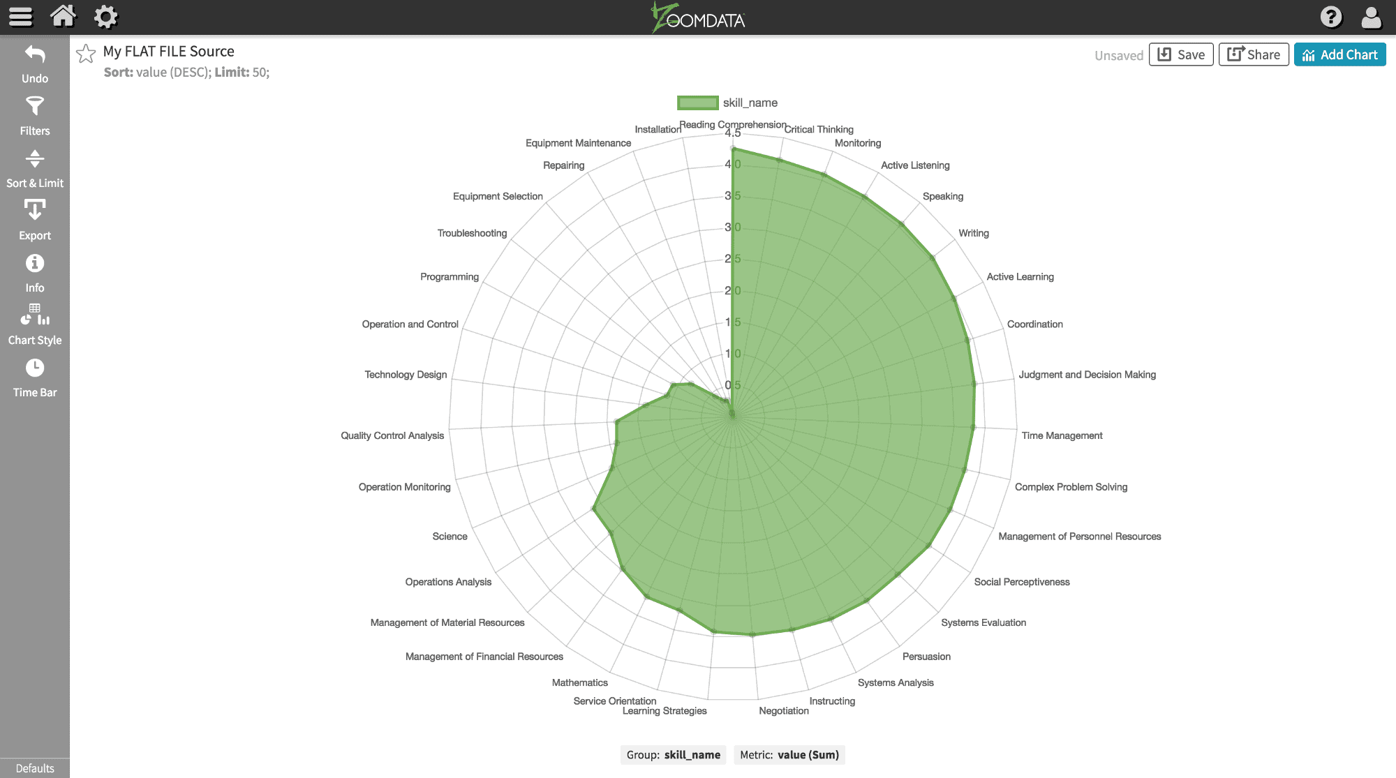
$ zd-chart pushNavigate to the Zoomdata client application and create a new chart from your
template. At first, the visualization will be unreadable as it is not yet
configured. Pick skill_name as Group and value as Metric, and you’ll see the
following:

You can also apply value as the sort by category to see your visualization in
greater detail.


