How To Keep Embedding Analytics Simple
Watch this video to learn how important it is to keep things simple when embedding visualizations.
With hundreds of thousands of fields to choose from for any chart, it’s a good idea to use filters to give users fewer options. For example, certain visualizations like a typical sales chart simply don’t need fields like latitude and longitude. You want enough options to make the chart useful and flexible but not enough to overwhelm the user. And a common pitfall with many charts is giving users the ability to select a combination of fields that return no data.
Transcript
The first topic that I'm gonna be talking about today is keeping it simple. It's not uncommon in big data sources to have hundreds or even thousands of fields to choose from, and one of the most common requirements in interactive data visualizations is to provide a filtering capability. So, instead of giving users hundreds and thousands of fields to choose from, it is best if you narrow it down to three or four fields to choose from. Let me show you an example.
Sales Volume by Product
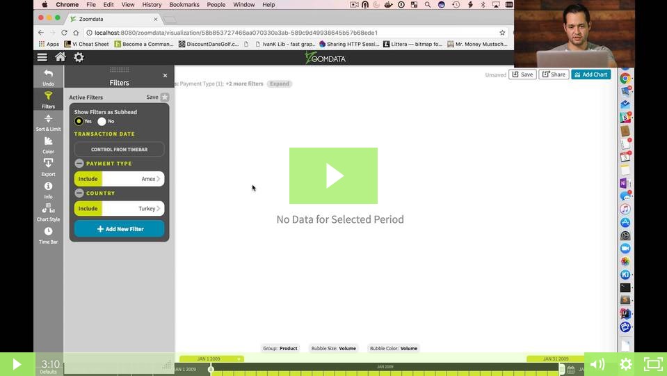
In this example, we're displaying a chart that's showing sales volume by product. On the left hand side, we have a control that allows us to select a number of fields to filter by. Right now, we have about 12 fields to choose from, a lot of these fields may not be relevant to the end user. For example, we see latitude and longitude that are typically using maps. We can also filter it by the name of the person who made a purchase, but that's typically not relevant when you're looking at overall sales.
Payment Type
So, let's make a selection here on payment type, and we're gonna filter by AmEx, and then we're gonna filter by country, and I'm going to select the country of Turkey. Now, as you can see, I've made a selection that has returned no data, and that's because I don't have any context between AmEx and Turkey, so I've gotten into an inconsistent state with my data.
We can make this example a little bit better by surfacing some dropdowns that would allow us to make sure that users don't get into this inconsistent state and will also make sure that people don't have unnecessary selections to choose from.
Filters
Now let's look at an example where we've actually surfaced two or three different filters to choose from, and we'll make sure that this time we don't run into an inconsistent state. So, as you can see, in the same visualization, we now have a dropdown for payment type. So, let's make our selection again for AmEx. And once we've made that selection, we now have automatically drawn a new dropdown for country, but it's now only gonna show us countries where we have transactions done by AmEx. So, as you can see, Turkey is not on the list, so we won't run into that same inconsistent state.
So, let's pick something else like Canada. Now when we go to cities, our cities are now filtered by Canada and by AmEx. So, this makes sure that, whenever we make a selection here, we're not gonna run into a situation where we have no data.
Now, it's way easier to use than looking over into the left hand side and making selections from a variety of filters to choose from. Let's make a selection here on Vancouver, and now we're done. Now that you've seen a better example, why don't we jump into the code, and I show you how I set this all up.
